# Activate License
> When using Hugeicons Pro icons, activate your license key to unlock all the Pro icons and developer features for your awesome projects.
To get started with a HugeIcons Pro package, you need to install it from npm, pnpm, yarn or bun.
**Note:** You can now use our private npm registry to install the HugeIcons Pro packages, and they are available for all users with an active subscription.
**🔥 Our custom registry now supports all pro styles 🔥**
```sh
# Stroke Styles
✨ @hugeicons-pro/core-stroke-rounded
✨ @hugeicons-pro/core-stroke-sharp
✨ @hugeicons-pro/core-stroke-standard
# Solid Styles
✨ @hugeicons-pro/core-solid-rounded
✨ @hugeicons-pro/core-solid-sharp
✨ @hugeicons-pro/core-solid-standard
# Special Styles
✨ @hugeicons-pro/core-bulk-rounded
✨ @hugeicons-pro/core-duotone-rounded
✨ @hugeicons-pro/core-twotone-rounded
```
## Configuration
Follow the steps below to install our HugeIcons packages and start using the icons in your project.
### 1. Create an Account
Visit our website [hugeicons.com](https://hugeicons.com) and create an account or log in if you already have one.
### 2. Get Your Universal License Key
Navigate to the Tokens tab and copy your `Universal License Key` to use as your npm token.
### 3. Authentication
***For NPM and old Yarn versions:***
- Create a new `.npmrc` file in your project root directory.
- Add the following line to your `.npmrc` file
```sh copy
//registry.npmjs.org/:_authToken=UNIVERSAL_LICENSE_KEY
```
- For the new npm registry, use the following registry:
```sh copy
@hugeicons-pro:registry=https://npm.hugeicons.com/
//npm.hugeicons.com/:_authToken=UNIVERSAL_LICENSE_KEY
```
***For new Yarn versions:***
- Add the following line to your `.yarnrc.yml` file
```sh copy
npmScopes:
hugeicons-pro:
npmAlwaysAuth: true
npmAuthToken: UNIVERSAL_LICENSE_KEY
npmRegistryServer: "https://npm.hugeicons.com/"
```
***For Bun:***
- Add this to your `config.toml` file
```sh copy
[install.scopes]
@hugeicons-pro = { token = "UNIVERSAL_LICENSE_KEY", url = "https://registry.npmjs.org/" }
```
- For the new npm registry, use the following registry:
```sh copy
[install.scopes]
@hugeicons-pro = { token = "UNIVERSAL_LICENSE_KEY", url = "https://npm.hugeicons.com/" }
```
Replace `UNIVERSAL_LICENSE_KEY` with the key you copied from the Tokens tab.
# Custom Icons
Custom Icons allows you to create and manage your own icon collections within the Hugeicons platform. With this feature, you can upload your SVG icons, organize them into collections, and use them alongside Hugeicons' professional icon sets.
> **Note**: Custom Icons feature is available exclusively for **Lifetime** license users.
## Getting Started
### Create a Collection
1. Navigate to the **Custom Icons** tab in your dashboard.
2. Click on the **Add New Collection** button.
3. Enter a name for your collection and click **Create Collection**.
### Upload Icons
You can upload SVG icons to your collection using these methods:
1. Click the **Upload Icons** button on your collection.
2. Drag and drop your SVG files into the upload area or click to select files from your device.
## Icon Naming Requirements
When uploading icons, follow these naming conventions:
- Use kebab-case for icon names (e.g., "menu-hamburger", "arrow-right")
- Names must:
- Use only lowercase letters, numbers, and hyphens
- Start with a letter
- Not have consecutive hyphens
## Using Your Custom Icons
### Download Package
Once you've uploaded your icons, you can download them as a package to use in your projects:
1. Click the **Download Package** button on your collection.
2. Follow these steps to implement in your project:
#### 1. Download and place the package
After downloading the package file, put it in a suitable place in your project.
#### 2. Import the Hugeicons component
```jsx
import { HugeiconsIcon } from "@hugeicons/react"
```
#### 3. Import the icons from the package
```jsx
import { Logo } from "/path/to/hgi-test"
```
#### 4. Use the icons in your components
```jsx
```
## Managing Collections
You can manage your custom icon collections by:
- Adding more icons to existing collections
- Downloading the package with updated icons
- Deleting collections or individual icons when needed
The Custom Icons feature is designed to seamlessly integrate your own icons with the Hugeicons ecosystem, giving you more flexibility while maintaining a consistent implementation across your projects. # Introduction to Hugeicons
Hugeicons is a beautiful icon library created to make your web and mobile projects look more polished and user-friendly.
With over 40,000 icons in 9 different styles, Hugeicons provides a wide range of icons for every project, whether you're a designer, developer, or content creator.
Trusted by over 150,000+ creatives, Hugeicons is known for its quality, beautiful icons, and user-friendly interface, making it one of the best icon libraries available for both personal and commercial projects.
## Key Features
#### Free Version:
- 4,000+ stroke-rounded icons
- Access to **Free** Figma file & plugin, Icon Font, Packages, WordPress & VS Code plugins, or the [Web app](https://hugeicons.com/icons?style=Stroke&type=Rounded).
- Search icons manually on the web app.
- Unlimited personal and commercial projects.
#### Pro Version:
- Unlock 40,000+ beautiful icons in 9 unique styles.
- Access to **Premium** Figma file & plugin, Icon Font, Packages, WordPress & VS Code plugins, or the [Web app](https://hugeicons.com/icons).
- Perfect for both personal and commercial projects.
- Mulitple seats for team
- Find icons faster with AI-powered search.
- And many more [Features](https://hugeicons.com/pricing).
## What is Hugeicons Pro?
Hugeicons Pro is the premium version of the Hugeicons icon library, designed for professionals and teams who need a wider selection of icons and greater flexibility.
It offers access to all Pro icons, including future updates, **Figma files for design systems,** and all **popular [dev formats](https://hugeicons.com/packages),** along with a license key for individual or team use.
Also, you will get access to the premium Figma plugin, VS Code, and WordPress plugins. Additionally, access to our web app, allowing you to search, preview, and download icons effortlessly.
#### Who is Hugeicons Pro for?
- Designers: Create beautiful user interfaces and make your projects stand out.
- Developers: Integrate icons easily with React, React-Native, Flutter, Angular, Vue, WordPress, and HTML/CSS.
- Content Creators: Use icons to make your blogs, presentations, and websites more engaging.
> **Ready to upgrade?** Check out the [Pro version](https://hugeicons.com/pricing).
## How to Use Hugeicons
#### Designer or Creator:
- Figma plugin for quick searches and adding icons to your designs.
- Figma file: Stroke version for customization and outlined/filled version for design system.
- SVGs: Search, copy, and download [SVG icons](https://hugeicons.com/icons) to use in any tool that supports vector graphics.
#### Developer:
- Check out the [Pro packages guide](https://docs.hugeicons.com/core-packages) for use cases and integration tips.
- Search, copy icon name, copy icon format and download [SVG icons](https://hugeicons.com/icons).
> _If you want to use the [Free packages](https://hugeicons.com/packages), Hugeicons provides 4,000+ free stroke rounded icons._
## Help & Support
Need help or want to connect with us? Join our community!
- Twitter: Follow us on [Twitter](https://x.com/huge_icons) for regular updates.
- Discord: To request new icons, features or a bug, join our [Discord channel](https://discord.gg/mauDATBZgE).
# Icon Library & Styles
The HugeIcons Icon Library stands at the core of our offering, providing a vast and diverse collection of over 40,000 professionally designed icons.
Each icon is available in 9 different styles through our modular package system, ensuring you can find the perfect style for your project while maintaining optimal bundle size.
## Overview
Our Icon Library is meticulously organized into categories and styles, making it easy to navigate and find the icons you need.
Whether you're looking for icons for web design, mobile applications, or marketing materials, HugeIcons has you covered with its comprehensive collection.
## Features
### Expansive Collection
- **Over 40,000 Icons:** From basic shapes to complex illustrations, our library includes icons for every possible need.
- **9 Unique Styles:** Each icon is available in 9 different styles, including stroke, solid, and special treatments.
- **Diverse Categories:** Icons are organized into categories such as Business, Social Media, UI/UX, Weather, and more.
### Icon Styles
Our icons are available in three main categories, each with multiple style variations:
1. **Stroke Styles** (Line icons with different corner styles)
- Core Stroke Rounded
- Core Stroke Sharp
- Core Stroke Standard
2. **Solid Styles** (Filled icons with different corner styles)
- Core Solid Rounded
- Core Solid Sharp
- Core Solid Standard
3. **Special Styles** (Unique visual treatments)
- Core Bulk Rounded (Chunky style with depth)
- Core Duotone Rounded (Two-color design with primary/secondary emphasis)
- Core Twotone Rounded (Alternative two-color treatment)
### High-Quality Design
- **Professional Quality:** Each icon is crafted by expert designers, ensuring they are of the highest quality.
- **Consistent Style:** Icons maintain consistency across different styles and categories.
- **Modern Design:** Regular updates to keep up with current design trends and user needs.
### Package Structure
Icons are organized into separate npm packages by style, allowing you to:
- Install only the styles you need
- Reduce bundle size
- Maintain clean dependencies
```bash
# Framework Component (Required)
npm install @hugeicons/react
# Icon Style Package (Choose one or more)
npm install @hugeicons-pro/core-stroke-rounded
```
## Using the Icon Library
To use icons from the HugeIcons library:
1. **Install Packages:**
```bash
# Install the framework component
npm install @hugeicons/react
# Install your preferred style package
npm install @hugeicons-pro/core-stroke-rounded
```
2. **Import Components:**
```jsx
// Import the framework component
import { HugeiconsIcon } from '@hugeicons/react'
// Import icons from your chosen style package
import { SearchIcon } from '@hugeicons-pro/core-stroke-rounded'
```
3. **Use in Your Components:**
```jsx
function MyComponent() {
return
}
```
### Interactive Example
Here's an example of using different styles for interactive states:
```jsx
import { HugeiconsIcon } from '@hugeicons/react'
import { HeartIcon } from '@hugeicons-pro/core-stroke-rounded'
import { HeartIcon as HeartFilled } from '@hugeicons-pro/core-solid-rounded'
function LikeButton({ isLiked, onClick }) {
return (
)
}
```
## Continuous Updates
The HugeIcons library is continuously updated with:
- New icons and categories
- Additional style variations
- Performance improvements
- Enhanced compatibility with popular frameworks
## Framework Support
For framework-specific integration guides and examples, refer to:
- [React](/integrations/react)
- [Vue](/integrations/vue)
- [Angular](/integrations/angular)
- [Svelte](/integrations/svelte)
- [React Native](/integrations/react-native)
# IDE Autocomplete Feature
HugeIcons provides comprehensive TypeScript support across all our packages, offering an enhanced development experience with IDE autocompletion. This feature accelerates your development process by providing intelligent suggestions for icon names, props, and types.
## TypeScript Integration
Our TypeScript integration provides several benefits:
- **Type Safety:** Full type checking for all icon components and props
- **Intelligent Suggestions:** Real-time icon and prop suggestions
- **Error Prevention:** Catch potential issues during development
- **Documentation:** Inline documentation for props and components
## Package-Specific Types
Each style package includes its own TypeScript definitions. You'll need both the framework component and the icon package:
```tsx copy
// Import the framework component
import { HugeiconsIcon } from '@hugeicons/react';
// Import icons from style packages
import { SearchIcon } from '@hugeicons-pro/core-stroke-rounded';
import { SearchIcon as SearchSolid } from '@hugeicons-pro/core-solid-rounded';
import { SearchIcon as SearchBulk } from '@hugeicons-pro/core-bulk-rounded';
```
## Prop Type Checking
TypeScript provides automatic type checking for all icon props:
```tsx copy
import { HugeiconsIcon } from '@hugeicons/react';
import { SearchIcon } from '@hugeicons-pro/core-stroke-rounded';
// TypeScript will enforce correct prop types
```
## Autocomplete Features
### 1. Import Suggestions
As you type your import statements, your IDE will suggest available components and icons:
```tsx copy
// Framework component suggestions
import { Huge... } from '@hugeicons/react';
// Suggests: HugeiconsIcon
// Icon suggestions
import { Sea... } from '@hugeicons-pro/core-stroke-rounded';
// Suggests: SearchIcon, SealIcon, SeaWavesIcon, etc.
```
### 2. Prop Suggestions
When using the HugeiconsIcon component, get suggestions for available props:
```tsx copy
```
### 3. Value Type Hints
Get immediate feedback on prop value types:
```tsx copy
```
## Style-Specific Autocompletion
Different icon styles may have different available props:
```tsx copy
import { HugeiconsIcon } from '@hugeicons/react';
// Stroke style icons include strokeWidth
import { SearchIcon } from '@hugeicons-pro/core-stroke-rounded';
// Solid style icons don't have strokeWidth
import { SearchIcon as SearchSolid } from '@hugeicons-pro/core-solid-rounded';
// strokeWidth prop not recommended
// Special styles may have style-specific props
import { SearchIcon as SearchDuotone } from '@hugeicons-pro/core-duotone-rounded';
```
## Framework Integration
Our TypeScript support extends to all supported frameworks, each with their own component package:
```tsx copy
// React
import { HugeiconsIcon } from '@hugeicons/react';
import { SearchIcon } from '@hugeicons-pro/core-stroke-rounded';
// Vue
import { HugeiconsIcon } from '@hugeicons/vue';
import { SearchIcon } from '@hugeicons-pro/core-stroke-rounded';
// Angular
import { HugeiconsIcon } from '@hugeicons/angular';
import { SearchIcon } from '@hugeicons-pro/core-stroke-rounded';
// Svelte
import { HugeiconsIcon } from '@hugeicons/svelte';
import { SearchIcon } from '@hugeicons-pro/core-stroke-rounded';
// React Native
import { HugeiconsIcon } from '@hugeicons/react-native';
import { SearchIcon } from '@hugeicons-pro/core-stroke-rounded';
```
## IDE Support
HugeIcons' TypeScript integration works with all major IDEs:
- Visual Studio Code
- WebStorm
- Atom
- Sublime Text (with TypeScript plugin)
- Vim/Neovim (with TypeScript plugin)
## Best Practices
1. **Use TypeScript:** Enable TypeScript in your project for the best development experience
2. **Enable Editor Support:** Ensure your IDE's TypeScript and JavaScript language features are enabled
3. **Keep Updated:** Use the latest versions of our packages for the most accurate type definitions
4. **Import Types:** If needed, you can import types directly from our packages:
```tsx copy
import type { IconProps } from '@hugeicons/react';
```
# Icon Customization
HugeIcons provides extensive customization options through the `HugeiconsIcon` component, allowing you to perfectly match your project's design requirements. Our icons are designed to be flexible while maintaining their professional quality across all customization options.
## Customization Options
The `HugeiconsIcon` component accepts various props to match your design needs:
- **Size:** Adjust dimensions to fit your UI requirements
- **Color:** Match your brand colors and theme
- **Stroke Width:** Fine-tune line thickness (for stroke variants)
- **Alt Icon:** Switch between two icons for interactive states
- **Style Selection:** Choose from 9 different icon style packages
## Style Packages
Instead of using variant props, HugeIcons uses separate packages for different styles:
```bash
# Stroke Styles
npm install @hugeicons-pro/core-stroke-rounded
npm install @hugeicons-pro/core-stroke-sharp
npm install @hugeicons-pro/core-stroke-standard
# Solid Styles
npm install @hugeicons-pro/core-solid-rounded
npm install @hugeicons-pro/core-solid-sharp
npm install @hugeicons-pro/core-solid-standard
# Special Styles
npm install @hugeicons-pro/core-bulk-rounded
npm install @hugeicons-pro/core-duotone-rounded
npm install @hugeicons-pro/core-twotone-rounded
```
## Basic Properties
### Size Customization
Adjust the icon size using the `size` prop (in pixels):
```jsx copy
import { HugeiconsIcon } from '@hugeicons/react';
import { SearchIcon } from '@hugeicons-pro/core-stroke-rounded';
// Default size is 24px
```
### Color Customization
Change the icon color using the `color` prop:
```jsx copy
import { HugeiconsIcon } from '@hugeicons/react';
import { SearchIcon } from '@hugeicons-pro/core-stroke-rounded';
// Using named colors
// Using hex values
// Using CSS custom properties
```
### Stroke Width
For stroke-style icons, adjust the line thickness:
```jsx copy
import { HugeiconsIcon } from '@hugeicons/react';
import { SearchIcon } from '@hugeicons-pro/core-stroke-rounded';
// Default strokeWidth is 1.5
```
### Interactive States
Use `altIcon` and `showAlt` props for interactive states:
```jsx copy
import { HugeiconsIcon } from '@hugeicons/react';
import { HeartIcon } from '@hugeicons-pro/core-stroke-rounded';
import { HeartIcon as HeartFilled } from '@hugeicons-pro/core-solid-rounded';
```
## Style-Specific Features
### Stroke Styles
- Adjustable stroke width
- Clean, scalable line icons
- Three corner styles: rounded, sharp, and standard
```jsx copy
import { HugeiconsIcon } from '@hugeicons/react';
import { SearchIcon } from '@hugeicons-pro/core-stroke-rounded';
```
### Solid Styles
- Full color fill
- Great for emphasis
- Three corner variations
```jsx copy
import { HugeiconsIcon } from '@hugeicons/react';
import { SearchIcon } from '@hugeicons-pro/core-solid-rounded';
```
### Special Styles
#### Bulk Style
```jsx copy
import { HugeiconsIcon } from '@hugeicons/react';
import { SearchIcon } from '@hugeicons-pro/core-bulk-rounded';
```
#### Duotone Style
```jsx copy
import { HugeiconsIcon } from '@hugeicons/react';
import { SearchIcon } from '@hugeicons-pro/core-duotone-rounded';
```
#### Twotone Style
```jsx copy
import { HugeiconsIcon } from '@hugeicons/react';
import { SearchIcon } from '@hugeicons-pro/core-twotone-rounded';
```
## Best Practices
1. **Consistency:** Use the same style package throughout your project for visual coherence
2. **Bundle Size:** Import only the style package you need
3. **Color Inheritance:** Use `currentColor` to inherit colors from parent elements
4. **Responsive Design:** Adjust icon sizes based on viewport or container size
5. **Accessibility:** Ensure sufficient color contrast and provide appropriate aria labels
6. **Interactive States:** Use `altIcon` and `showAlt` for hover, active, or selected states
## Framework Integration
For framework-specific customization options and best practices, refer to our integration guides:
- [React](/integrations/react)
- [Vue](/integrations/vue)
- [Angular](/integrations/angular)
- [Svelte](/integrations/svelte)
- [React Native](/integrations/react-native)
# Troubleshooting: Common Issues
When integrating and using HugeIcons in your projects, you might encounter some common issues. This guide aims to address these problems, providing solutions to ensure a smooth experience with HugeIcons.
## Icons Not Rendering
**Symptoms:**
- Icons do not appear in your application.
- Icons are replaced by a blank space or broken image icon.
**Solutions:**
1. **Check Package Installation:** Ensure you have installed both the framework component package and at least one icon style package:
```bash
# Install the framework package (e.g., React)
npm install @hugeicons/react
# Install at least one icon style package
npm install @hugeicons-pro/core-stroke-rounded
```
2. **Verify Imports:** Make sure you're importing both the framework component and icons correctly:
```jsx
// Import the framework component
import { HugeiconsIcon } from '@hugeicons/react';
// Import the icon
import { SearchIcon } from '@hugeicons-pro/core-stroke-rounded';
```
3. **Check Component Usage:** Ensure you're using the component correctly with required props:
```jsx
```
## Icons Displaying Incorrectly
**Symptoms:**
- Icons appear distorted, wrong color, or wrong size
- Stroke width issues with line icons
- Two-tone colors not showing correctly
**Solutions:**
1. **Check Props:** Verify the props being passed to the icon component:
- `size`: Should be a number (default: 24)
- `color`: Should be a valid CSS color value
- `strokeWidth`: Only works with stroke-style icons (default: 1.5)
2. **Style Package Compatibility:** Ensure you're using the correct props for your icon style:
- Stroke icons: Can use `strokeWidth`
- Solid icons: Ignore `strokeWidth`
- Two-tone/Duotone: May require specific color handling
3. **CSS Conflicts:** Check for CSS rules that might override icon styles:
```css
/* Avoid generic SVG styles that might affect icons */
svg {
width: auto;
height: auto;
}
```
## Performance Issues
**Symptoms:**
- Slow loading times
- Large bundle sizes
- Performance degradation with many icons
**Solutions:**
1. **Optimize Imports:** Import only the specific icons you need:
```jsx
// Good - specific import
import { SearchIcon } from '@hugeicons-pro/core-stroke-rounded';
// Bad - importing entire package
import * from '@hugeicons-pro/core-stroke-rounded';
```
2. **Use Dynamic Imports:** For icons not needed immediately:
```jsx
const SearchIcon = dynamic(() =>
import('@hugeicons-pro/core-stroke-rounded').then(mod => mod.SearchIcon)
)
```
3. **Bundle Size Management:**
- Use a single style package when possible
- Leverage tree shaking by using named imports
- Monitor bundle size with tools like `webpack-bundle-analyzer`
## Framework-Specific Issues
If you're experiencing framework-specific issues, please refer to our dedicated integration guides:
- [React](/integrations/react)
- [Vue](/integrations/vue)
- [Angular](/integrations/angular)
- [Svelte](/integrations/svelte)
- [React Native](/integrations/react-native)
## TypeScript Module Resolution Issues
**Cannot find module '@hugeicons-pro/core-*' or its corresponding type declarations**
**Error Message:**
```
Cannot find module '@hugeicons-pro/core-solid-rounded' or its corresponding type declarations.
There are types at '.../node_modules/@hugeicons-pro/core-solid-rounded/dist/types/index.d.ts', but this result could not be resolved under your current 'moduleResolution' setting.
```
**Solution:**
Update your `tsconfig.json` to use modern module resolution:
```json:tsconfig.json
{
"compilerOptions": {
"module": "ESNext",
"moduleResolution": "bundler"
}
}
```
Alternatively, you can use `"node16"` or `"nodenext"` for the `moduleResolution` setting.
This issue occurs because the package uses modern ESM module resolution, which requires TypeScript to be configured appropriately. The older `"node"` module resolution strategy doesn't handle some modern package patterns correctly.
# Pro Icon Packages
HugeIcons provides its icons through separate npm packages, allowing you to install only the styles you need. Each package contains a specific icon style, helping you keep your bundle size minimal.
> **Warning**: Core packages only contain the icon assets. To use these icons in your project, you'll need to install the appropriate framework-specific package (e.g., `@hugeicons/react`, `@hugeicons/vue`, etc.) alongside your chosen core package. Visit our [framework integration guides](#using-with-framework-components) for detailed setup instructions.
## Quick Start
Get started with HugeIcons in 2 simple steps:
```bash copy
# 1. Install your preferred style package
npm install @hugeicons-pro/core-stroke-rounded
# 2. Import the icon you need
import { SearchIcon } from '@hugeicons-pro/core-stroke-rounded'
```
## Available Icon Styles
Right-click on any style to copy its installation command (npm, yarn, pnpm, or bun).
import IconStylesGrid from '../components/IconStylesGrid'
## Package Structure
Each icon is available in 9 different styles, organized into separate packages:
```bash copy
# Stroke Styles (Line icons with different corner styles)
@hugeicons-pro/core-stroke-rounded
@hugeicons-pro/core-stroke-sharp
@hugeicons-pro/core-stroke-standard
# Solid Styles (Filled icons with different corner styles)
@hugeicons-pro/core-solid-rounded
@hugeicons-pro/core-solid-sharp
@hugeicons-pro/core-solid-standard
# Special Styles (Unique visual treatments)
@hugeicons-pro/core-bulk-rounded # Chunky style with depth
@hugeicons-pro/core-duotone-rounded # Two-color design with primary/secondary emphasis
@hugeicons-pro/core-twotone-rounded # Alternative two-color treatment
```
## Installation
Install your preferred icon package using npm, yarn, or pnpm:
```sh npm2yarn
npm install @hugeicons-pro/core-stroke-rounded
```
You can install multiple packages if you want to use different styles in your project:
```sh npm2yarn
npm install @hugeicons-pro/core-stroke-rounded @hugeicons-pro/core-solid-rounded
```
## Importing Icons
Each icon in our packages can be imported using either its main name or its style-specific alias:
```jsx copy
// Using the main name (recommended)
import { SearchIcon } from '@hugeicons-pro/core-stroke-rounded';
// Using the style-specific alias
import { SearchStrokeRounded } from '@hugeicons-pro/core-stroke-rounded';
```
When using the same icon from different style packages, you have two approaches to avoid naming conflicts:
1. Using the `as` keyword to create aliases:
```jsx copy
import { SearchIcon as SearchStroke } from '@hugeicons-pro/core-stroke-rounded';
import { SearchIcon as SearchSolid } from '@hugeicons-pro/core-solid-rounded';
```
2. Using the native style-specific aliases:
```jsx copy
import { SearchStrokeRounded } from '@hugeicons-pro/core-stroke-rounded';
import { SearchSolidRounded } from '@hugeicons-pro/core-solid-rounded';
```
Both approaches work equally well - choose the one that better fits your coding style. The first approach using `as` is more explicit about the relationship between the icons, while the second approach using native aliases might be more concise.
## Icon Naming Convention
Our icons follow a consistent naming pattern:
1. **Basic Icons**: Simple, descriptive names
```jsx copy
import { HomeIcon, SearchIcon, UserIcon } from '@hugeicons-pro/core-stroke-rounded';
```
2. **Variant Icons**: Numbered suffixes for different versions
```jsx copy
import { Notification01Icon, Notification02Icon, Notification03Icon } from '@hugeicons-pro/core-stroke-rounded';
```
3. **Style-Specific Names**: Full style name for explicit imports
```jsx copy
import { HomeStrokeRounded, SearchStrokeRounded } from '@hugeicons-pro/core-stroke-rounded';
import { HomeSolidRounded, SearchSolidRounded } from '@hugeicons-pro/core-solid-rounded';
```
## Bundle Size Optimization
To keep your application's bundle size minimal, we recommend:
1. **Tree Shaking**: Our packages support tree shaking out of the box. Only the icons you import will be included in your final bundle.
2. **Single Style Package**: If possible, stick to one style package throughout your application.
3. **Dynamic Imports**: For applications with many icons, consider using dynamic imports:
```jsx
// Instead of static import
import { SearchIcon } from '@hugeicons-pro/core-stroke-rounded'
// Use dynamic import
const SearchIcon = dynamic(() =>
import('@hugeicons-pro/core-stroke-rounded').then(mod => mod.SearchIcon)
)
```
4. **Monitor Bundle Size**: Use tools like `webpack-bundle-analyzer` to track which icons are included in your bundle.
## Using with Framework Components
After installing your desired icon packages, you'll need to use them with our framework-specific components. Check out our integration guides for:
- [React](/integrations/react)
- [Vue](/integrations/vue)
- [Angular](/integrations/angular)
- [Svelte](/integrations/svelte)
- [React Native](/integrations/react-native) # License Agreement
**Effective as of 24 Apr 2024**
By using, purchasing, or downloading any Hugeicons Pro icon/pack/library (including the free versions, you are consenting to the terms outlined in this license agreement. Please acquaint yourself with the permissions and restrictions concerning the use of the services and the files that you receive free or post-purchase.
This legally binding agreement ("Agreement") establishes the terms between you, hereafter referred to as the "Licensee" or "Customer", and Hugeicons Pro, operated by HLAB UX WEB DESIGN CO LLC, henceforth identified as the "Licensor", "Company", or "we", "us", "our". HLAB UX WEB DESIGN CO LLC [اتش لاب لتصميم مواقع الشبكة المعلوماتية (الانترنت) ذ.م.م] is registered in the United Arab Emirates, under license number 1265530.
Please note that within the scope of this agreement and in any related documentation or communication, the terms "Hugeicons" and "Hugeicons Pro" are used interchangeably and refer to the same product offering by HLAB UX WEB DESIGN CO LLC. No distinction is made between these terms regarding the licensing, usage, and services provided.
## **Definition of End Product:**
An End Product is a customized implementation of the icons. For example, the icons may be part of a package of UI elements, and the End Product is your unique finished website or application design that incorporates these icons.
## You are allowed to:
1. You may use the icons to design and develop end products for your clients, tailored to their specific needs.
2. You are free to use the icons in your own personal or commercial projects.
3. You may create icon variations by modifying Hugelcons Pro icons.
4. This license is multi-use, meaning you can employ the icons across various projects without limitation.
5. You may publish the icons in your team library or share them within your organization if you have purchased either a startup or business license:
a. **Startup License:** Allows up to 5 users. Publishing the icons in a team library is restricted to no more than 5 users.
b. **Business License:** Allows up to 25 users. Publishing the icons in a team library is restricted to no more than 25 users.
If your team exceeds these user limits, you must purchase additional licenses to accommodate the extra users.
### **Examples of Usage Allowed by the License:**
* You can use the icons while creating websites, either for yourself or for a client.
* You are permitted to include the icons in web applications or mobile apps, whether they are commercial or personal projects.
* The icons can be used in commercial SaaS applications or websites that charge users a subscription fee or a one-time fee.
* You can use the icons for creating an internal design system.
* You are allowed to incorporate the icons into UI kits, templates, and design systems intended for sale or distribution for free.
However, it is important to note that you cannot sell or share the icons themselves as standalone assets or as part of any asset bundle. The icons must be used as elements within your projects or products.
## **You are NOT allowed to:**
1. You cannot share the license key, Figma file link, icon SVG files, or fonts on the web or distribute them with public access.
2. You cannot place any of the icon files directly into the end product as they are.
3. You are prohibited from redistributing the icons as stock, within a tool or template, or with source files. This restriction also applies to using the icons to create a template or library for other platforms or software, such as Shopify, Adobe XD, Framer, Webflow, HTML, CSS, React, WordPress, Tailwind, and similar platforms. This includes either standalone use or bundling with other items, even if the icons are modified.
4. You cannot redistribute or make available the icons as-is or with modifications.
5. You cannot publish the icons in your team library or give edit permissions to other people if you have purchased an individual license, or if the number of license seats is fewer than the number of your team members.
6. Hugeicons Pro icons cannot be used in any product that competes directly with Hugeicons Pro. This is to prevent the use of our icons in competing icon products, which may not adhere to the same high standards of quality, design, and usability that Hugeicons Pro maintains. Such use could disadvantage Hugeicons Pro by diluting the brand and integrity of our products. By prohibiting these activities, we aim to protect the unique value and appeal of Hugeicons Pro icons, ensuring they remain distinctive and valuable in the market.
### **Examples of Usage Not Allowed by the License:**
* Sharing or publishing icon files or assets within the files online or making them publicly available.
* Sharing files or assets with other users who have not purchased a license.
* Creating a Sketch, Adobe XD, Framer, React, Vue, HTML, Bootstrap, Flutter or Tailwind version of Hugeicons Pro and making it available for free or for sale.
## **Refund Policy**
Hugeicons Pro required substantial effort to create. When you buy any Hugeicons Pro plan, You gain lifetime access to our downloadable files. Refunds are available only in cases of critical issues that prevent you from accessing the Content. If you encounter any issues, contact us via hugeicons@halallab.co within 30 days of purchase.
Please note we cannot issue a refund if you simply change your mind after purchasing, decide not to use the file, or are unfamiliar with Figma or Development Tools features.
If we issue a refund, you agree to delete all paid icons within 24 hours and are not permitted to use paid icons in projects (including personal/non-commercial projects).
## **License Expiration and Access Terms**
When you purchase any Hugeicons Pro plan, you are granted lifetime access to offline icon files, such as SVGs and Figma files. This means that once you have downloaded these files, you may continue to use them indefinitely under the terms of this agreement, regardless of the status of your subscription.
In addition to offline files, purchasing any Hugeicons Pro plan provides you with a license key. This key allows you to use our Figma plugin, access icons directly from our website, use icon fonts, npm packages, CDN services, React components, and all other online services we offer. If you opt for a yearly plan, this access is contingent upon the renewal of your subscription. Should your yearly plan expire, you will lose access to any services that require active license verification through the license key.
If your yearly plan expires, you may no longer have access to updates or the ability to use the licensed services online, but you retain the right to use any offline files you have already downloaded. These files can continue to be used for a lifetime, strictly adhering to the terms laid out in this agreement.
## **Governing Law – Jurisdiction**
This Agreement is governed by the laws of the United Arab Emirates, without regard to its conflicts of laws principles. Any disputes arising from or relating to this Agreement shall be resolved in the competent courts located in the United Arab Emirates, and each party consents to the exclusive jurisdiction and venue of these courts.
## **Enforcement**
Should Hugeicons Pro, operated by HLAB UX WEB DESIGN CO LLC, discover that the Customer or any of their Users has breached this Agreement, Hugeicons Pro may terminate this Agreement, restrict the Customer's ability to download icons, or use the Hugeicons Pro services. Upon such termination or restriction, notice will be sent to the email address provided by the Customer at the time of purchase. This right of enforcement includes, but is not limited to, the ability to take legal action to ensure compliance with the terms of this Agreement.
## **Limitation of Liability**
HLAB UX WEB DESIGN CO LLC's liability to you for costs, damages, or other losses arising from your use of Hugeicons Pro — including third-party claims against you — is limited to a refund of your purchase price.
HLAB UX WEB DESIGN CO LLC shall not be held liable for any consequential, indirect, incidental, special, or punitive damages related to your use of Hugeicons Pro, regardless of whether such damages were foreseeable and whether or not HLAB UX WEB DESIGN CO LLC has been advised of the possibility of such damages.
## **Definition of Lifetime Package/Access:**
"Lifetime Package/Access" grants the user the right to retain and use the offline files provided with Hugeicons Pro for a lifetime, without any expiration or additional fees. This means that once a user has downloaded the offline files, they can continue to use them indefinitely for their projects in accordance with the terms of this license agreement.
In addition to offline file access, Lifetime Package/Access includes the use of online services provided by Hugeicons Pro as long as these services are available and the product exists. Please note that the availability of online services is contingent upon the continued operation of Hugeicons Pro and may be subject to future conditions and changes beyond our control.
## **Request New/Missing Icons Feature Terms:**
At Hugeicons Pro, we are committed to continually improving and expanding our icon library to meet the diverse needs of our users. To support this goal, we offer the "Request New Icons" feature, allowing users to suggest additional icons at no additional cost. This service is designed to ensure our library remains comprehensive and responsive to user needs.
1. All icon requests must be legitimate and clearly justified to ensure they meet the general needs of our user base. We reserve the right to assess the relevance and appropriateness of each request.
2. We maintain the right to refuse requests for icons that are in opposition to our company's moral and ethical standards. The decision to design a requested icon remains at our sole discretion.
3. We reserve the right to modify, limit, or discontinue the "Request New Icons" feature at any time without notice. This may include suspending the service temporarily or permanently, based on operational needs or strategic considerations.
# FAQs: Technical Support
Getting the help you need when you encounter issues or have questions about HugeIcons is straightforward. Below you'll find information on how to reach our technical support team and the resources available to you.
## How can I get technical support for HugeIcons?
We offer several channels for technical support to ensure you receive the assistance you need:
- **Discord:** Join our community on Discord for support and to connect with other users. It's a great place to share tips, ask questions, and get real-time assistance. Join our Discord server.
- **Twitter:** Follow us on Twitter @huge_icons for updates, tips, and direct support through Tweets or Direct Messages. [Follow HugeIcons on Twitter](https://twitter.com/huge_icons).
- **Email:** For more detailed inquiries or if you require personalized assistance, feel free to email us at hugeicons@halallab.co. We aim to respond to all emails within 24-48 hours.
## What information should I provide when seeking technical support?
To help us assist you more efficiently, please include the following information in your support request:
- A clear and concise description of the issue or question.
- Any relevant code snippets or screenshots that illustrate the problem.
- The version of the HugeIcons package you're using.
- Your development environment details (e.g., browser version, React or React Native version).
## Can I request new features or icons?
Absolutely! We're always looking to improve HugeIcons and expand our icon library. If you have suggestions for new features or specific icons you'd like to see, please reach out via any of our support channels. We appreciate your feedback and contributions to making HugeIcons even better.
## Is there a roadmap for future updates?
Yes, we maintain a roadmap of upcoming features and improvements based on user feedback and our own vision for HugeIcons. While we may not be able to share specific release dates, we're committed to continuously enhancing the library. Keep an eye on our Twitter account and join our Discord server for the latest updates and announcements.
Remember, our goal is to provide you with the support you need to use HugeIcons effectively in your projects. Don't hesitate to reach out with any questions or feedback — we're here to help!
# React Native
The `@hugeicons/react-native` package is freely available on the public npm registry. To use HugeIcons in your React Native project, you'll need to install both the React Native component package and at least one icon package of your choice. This modular approach allows you to keep your bundle size minimal by including only the icons you plan to use.
## Installation
1. Install the React Native component package:
```sh npm2yarn
npm install @hugeicons/react-native
```
2. Install your preferred icon package(s):
```sh npm2yarn
npm install @hugeicons-pro/core-{variant}-{style}
```
**Available styles:**
HugeIcons Pro offers 40,000+ icons across 9 unique styles:
```bash copy
# Stroke Styles (Line icons with different corner styles)
@hugeicons-pro/core-stroke-rounded
@hugeicons-pro/core-stroke-sharp
@hugeicons-pro/core-stroke-standard
# Solid Styles (Filled icons with different corner styles)
@hugeicons-pro/core-solid-rounded
@hugeicons-pro/core-solid-sharp
@hugeicons-pro/core-solid-standard
# Special Styles (Unique visual treatments)
@hugeicons-pro/core-bulk-rounded # Chunky style with depth
@hugeicons-pro/core-duotone-rounded # Two-color design with primary/secondary emphasis
@hugeicons-pro/core-twotone-rounded # Alternative two-color treatment
```
For more detailed information about our core packages and available styles, please visit our [Core Packages](/core-packages) page.
## Basic Usage
```jsx copy
import { HugeiconsIcon } from '@hugeicons/react-native'
import { Notification03Icon } from '@hugeicons/core-free-icons'
function App() {
return
}
```
## Props
| Prop | Type | Default | Description |
| ----------- | ------------- | -------- | --------------------------------------------------------------------------------------- |
| icon | IconSvgObject | Required | The main icon component imported from an icon package |
| altIcon | IconSvgObject | - | Alternative icon component from an icon package for states, interactions, or animations |
| showAlt | boolean | false | When true, displays the altIcon instead of the main icon |
| size | number | 24 | Icon size in pixels |
| color | string | black | Icon color (any valid React Native color) |
| strokeWidth | number | 1.5 | Width of the icon strokes (works with stroke-style icons) |
| style | object | - | Additional styles (View style props) |
## Icon Naming
Each icon in our packages can be imported using either its main name or its style-specific alias:
```jsx copy
// Both imports refer to the same icon
import { SearchIcon } from '@hugeicons/core-free-icons'
import { SearchStrokeRounded } from '@hugeicons/core-free-icons'
```
We recommend using the shorter main name (e.g., `SearchIcon`) for better readability. The style-specific aliases are useful when importing the same icon from different style packages to avoid naming conflicts.
## Examples of Dynamic Icon Interactions
### Search Bar with Clear Button
A search input that shows a clear button when text is entered:
```jsx copy
import React, { useState } from 'react'
import { View, TextInput, TouchableOpacity } from 'react-native'
import { HugeiconsIcon } from '@hugeicons/react-native'
import { SearchIcon, CloseCircleIcon } from '@hugeicons/core-free-icons'
function SearchBar() {
const [value, setValue] = useState('')
return (
value.length > 0 && setValue('')}>
0} />
)
}
```
### Theme Toggle with Style Switch
A simple dark mode toggle using different icons:
```jsx copy
import React, { useState } from 'react'
import { TouchableOpacity } from 'react-native'
import { HugeiconsIcon } from '@hugeicons/react-native'
import { SunIcon, Moon02Icon } from '@hugeicons/core-free-icons'
function ThemeToggle() {
const [isDark, setIsDark] = useState(false)
return (
setIsDark(!isDark)}>
)
}
```
### Navigation Bar with Style Switch
A navigation bar that uses different icon styles to indicate the active state:
```jsx copy
import React, { useState } from 'react'
import { View, TouchableOpacity } from 'react-native'
import { HugeiconsIcon } from '@hugeicons/react-native'
import { HomeIcon, SearchIcon, Notification03Icon, UserIcon } from '@hugeicons/core-free-icons'
import {
HomeIcon as HomeDuotone,
SearchIcon as SearchDuotone,
Notification03Icon as NotificationDuotone,
UserIcon as UserDuotone,
} from '@hugeicons-pro/core-duotone-rounded'
function NavigationBar() {
const [activeTab, setActiveTab] = useState('home')
const navItems = [
{ id: 'home', solidIcon: HomeIcon, duotoneIcon: HomeDuotone },
{ id: 'search', solidIcon: SearchIcon, duotoneIcon: SearchDuotone },
{ id: 'notifications', solidIcon: Notification03Icon, duotoneIcon: NotificationDuotone },
{ id: 'profile', solidIcon: UserIcon, duotoneIcon: UserDuotone },
]
return (
{navItems.map(item => (
setActiveTab(item.id)}
style={[styles.navItem, activeTab === item.id && styles.activeNavItem]}
>
))}
)
}
```
# Vue
The `@hugeicons/vue` package is freely available on the public npm registry. To use HugeIcons in your Vue project, you'll need to install both the Vue component package and at least one icon package of your choice. This modular approach allows you to keep your bundle size minimal by including only the icons you plan to use.
## Installation
1. Install the Vue component package:
```sh npm2yarn
npm install @hugeicons/vue
```
2. Install your preferred icon package(s):
```sh npm2yarn
npm install @hugeicons-pro/core-{variant}-{style}
```
**Available styles:**
HugeIcons Pro offers 40,000+ icons across 9 unique styles:
```bash copy
# Stroke Styles (Line icons with different corner styles)
@hugeicons-pro/core-stroke-rounded
@hugeicons-pro/core-stroke-sharp
@hugeicons-pro/core-stroke-standard
# Solid Styles (Filled icons with different corner styles)
@hugeicons-pro/core-solid-rounded
@hugeicons-pro/core-solid-sharp
@hugeicons-pro/core-solid-standard
# Special Styles (Unique visual treatments)
@hugeicons-pro/core-bulk-rounded # Chunky style with depth
@hugeicons-pro/core-duotone-rounded # Two-color design with primary/secondary emphasis
@hugeicons-pro/core-twotone-rounded # Alternative two-color treatment
```
For more detailed information about our core packages and available styles, please visit our [Core Packages](/core-packages) page.
## Basic Usage
```vue copy
```
## Props
| Prop | Type | Default | Description |
| ----------- | ------------- | ------------ | --------------------------------------------------------------------------------------- |
| icon | IconSvgObject | Required | The main icon component imported from an icon package |
| altIcon | IconSvgObject | - | Alternative icon component from an icon package for states, interactions, or animations |
| showAlt | boolean | false | When true, displays the altIcon instead of the main icon |
| size | number | 24 | Icon size in pixels |
| color | string | currentColor | Icon color (CSS color value) |
| strokeWidth | number | 1.5 | Width of the icon strokes (works with stroke-style icons) |
| class | string | - | Additional CSS classes |
## Icon Naming
Each icon in our packages can be imported using either its main name or its style-specific alias:
```vue copy
// Both imports refer to the same icon import { SearchIcon } from '@hugeicons/core-free-icons' import { SearchStrokeRounded } from
'@hugeicons/core-free-icons'
```
We recommend using the shorter main name (e.g., `SearchIcon`) for better readability. The style-specific aliases are useful when importing the same icon from different style packages to avoid naming conflicts.
## Examples of Dynamic Icon Interactions
### Search Bar with Clear Button
A search input that shows a clear button when text is entered:
```vue copy
```
### Theme Toggle with Style Switch
A simple dark mode toggle using different icons:
```vue copy
```
### Navigation Bar with Style Switch
A navigation bar that uses different icon styles to indicate the active state:
```vue copy
```
# Angular
The `@hugeicons/angular` package is freely available on the public npm registry. To use HugeIcons in your Angular project, you'll need to install both the Angular component package and at least one icon package of your choice. This modular approach allows you to keep your bundle size minimal by including only the icons you plan to use.
## Installation
1. Install the Angular component package:
```sh npm2yarn
npm install @hugeicons/angular
```
2. Install your preferred icon package(s):
```sh npm2yarn
npm install @hugeicons-pro/core-{variant}-{style}
```
**Available styles:**
HugeIcons Pro offers 40,000+ icons across 9 unique styles:
```bash copy
# Stroke Styles (Line icons with different corner styles)
@hugeicons-pro/core-stroke-rounded
@hugeicons-pro/core-stroke-sharp
@hugeicons-pro/core-stroke-standard
# Solid Styles (Filled icons with different corner styles)
@hugeicons-pro/core-solid-rounded
@hugeicons-pro/core-solid-sharp
@hugeicons-pro/core-solid-standard
# Special Styles (Unique visual treatments)
@hugeicons-pro/core-bulk-rounded # Chunky style with depth
@hugeicons-pro/core-duotone-rounded # Two-color design with primary/secondary emphasis
@hugeicons-pro/core-twotone-rounded # Alternative two-color treatment
```
For more detailed information about our core packages and available styles, please visit our [Core Packages](/core-packages) page.
## Module Setup
Import the HugeIcons module in your app.module.ts:
```typescript copy
import { NgModule } from '@angular/core'
import { HugeiconsModule } from '@hugeicons/angular'
@NgModule({
imports: [HugeiconsModule],
})
export class AppModule {}
```
## Basic Usage
```typescript copy
// your.component.ts
import { Component } from '@angular/core'
import { Notification03Icon } from '@hugeicons/core-free-icons'
@Component({
selector: 'app-example',
template: ` `,
})
export class ExampleComponent {
notification03Icon = Notification03Icon
}
```
## Props
| Prop | Type | Default | Description |
| ----------- | ------------- | ------------ | --------------------------------------------------------------------------------------- |
| icon | IconSvgObject | Required | The main icon component imported from an icon package |
| altIcon | IconSvgObject | - | Alternative icon component from an icon package for states, interactions, or animations |
| showAlt | boolean | false | When true, displays the altIcon instead of the main icon |
| size | number | 24 | Icon size in pixels |
| color | string | currentColor | Icon color (CSS color value) |
| strokeWidth | number | 1.5 | Width of the icon strokes (works with stroke-style icons) |
| class | string | - | Additional CSS classes |
## Icon Naming
Each icon in our packages can be imported using either its main name or its style-specific alias:
```typescript copy
// Both imports refer to the same icon
import { SearchIcon } from '@hugeicons/core-free-icons'
import { SearchStrokeRounded } from '@hugeicons/core-free-icons'
```
We recommend using the shorter main name (e.g., `SearchIcon`) for better readability. The style-specific aliases are useful when importing the same icon from different style packages to avoid naming conflicts.
## Examples of Dynamic Icon Interactions
### Search Bar with Clear Button
A search input that shows a clear button when text is entered:
```typescript copy
// search.component.ts
import { Component } from '@angular/core'
import { SearchIcon, CloseCircleIcon } from '@hugeicons/core-free-icons'
@Component({
selector: 'app-search',
template: `
`,
})
export class SearchComponent {
searchIcon = SearchIcon
closeIcon = CloseCircleIcon
searchValue = ''
}
```
### Theme Toggle with Style Switch
A simple dark mode toggle using different icons:
```typescript copy
// theme-toggle.component.ts
import { Component } from '@angular/core'
import { SunIcon, Moon02Icon } from '@hugeicons/core-free-icons'
@Component({
selector: 'app-theme-toggle',
template: `
`,
})
export class ThemeToggleComponent {
sunIcon = SunIcon
moonIcon = Moon02Icon
isDark = false
}
```
### Navigation Bar with Style Switch
A navigation bar that uses different icon styles to indicate the active state:
```typescript copy
// nav.component.ts
import { Component } from '@angular/core'
import { HomeIcon, SearchIcon, Notification03Icon, UserIcon } from '@hugeicons/core-free-icons'
import {
HomeIcon as HomeDuotone,
SearchIcon as SearchDuotone,
Notification03Icon as NotificationDuotone,
UserIcon as UserDuotone,
} from '@hugeicons-pro/core-duotone-rounded'
@Component({
selector: 'app-nav',
template: `
`,
})
export class NavComponent {
activeTab = 'home'
navItems = [
{ id: 'home', solidIcon: HomeIcon, duotoneIcon: HomeDuotone },
{ id: 'search', solidIcon: SearchIcon, duotoneIcon: SearchDuotone },
{ id: 'notifications', solidIcon: Notification03Icon, duotoneIcon: NotificationDuotone },
{ id: 'profile', solidIcon: UserIcon, duotoneIcon: UserDuotone },
]
}
```
import { Callout } from 'nextra/components'
**A new update** of the HugeIcons Flutter package will be available soon with additional features and improvements.
# Pro Package Installation
To install the HugeIcons Pro package, you will find the installation instructions at your [HugeIcons account](https://hugeicons.com/account).
## Installation
You can install the HugeIcons package by adding it to your `pubspec.yaml` file:
```yaml copy
dependencies:
hugeicons: ^0.0.1
```
After adding the package to your `pubspec.yaml` file, run the following command to install the package:
```bash copy
flutter pub get
```
or
```bash copy
dart pub get
```
## Basic Usage
Import the package into your Flutter project:
```dart copy
import 'package:hugeicons/hugeicons.dart';
```
Here's an example of how to use HugeIcons in a Flutter application:
```dart copy
import 'package:flutter/material.dart';
import 'package:hugeicons/hugeicons.dart';
void main() {
runApp(MyApp());
}
class MyApp extends StatelessWidget {
@override
Widget build(BuildContext context) {
return MaterialApp(
home: Scaffold(
appBar: AppBar(
title: Text('Welcome to HugeIcons'),
),
body: Center(
child: Column(
mainAxisAlignment: MainAxisAlignment.center,
children: [
HugeIcon(
icon: HugeIcons.bulk_rounded_abacus,
color: Colors.red,
size: 100.0,
),
HugeIcon(
icon: HugeIcons.duotone_rounded_home_02,
color: Colors.blue,
size: 100.0,
),
HugeIcon(
icon: HugeIcons.stroke_sharp_home_01,
color: Colors.green,
size: 100.0,
),
],
),
),
),
);
}
}
```
In the example above, the `HugeIcon` widget is included in a Flutter application with custom size and color.
## Customizing Icons
You can customize icons further by using the `color`, `size`, `variant`, and `type` properties:
```dart copy
HugeIcon(
icon: HugeIcons.bulk_rounded_abacus,
color: Colors.red,
size: 100.0,
),
``` # Svelte
The `@hugeicons/svelte` package is freely available on the public npm registry. To use HugeIcons in your Svelte project, you'll need to install both the Svelte component package and at least one icon package of your choice. This modular approach allows you to keep your bundle size minimal by including only the icons you plan to use.
## Installation
1. Install the Svelte component package:
```sh npm2yarn
npm install @hugeicons/svelte
```
2. Install your preferred icon package(s):
```sh npm2yarn
npm install @hugeicons-pro/core-{variant}-{style}
```
**Available styles:**
HugeIcons Pro offers 40,000+ icons across 9 unique styles:
```bash copy
# Stroke Styles (Line icons with different corner styles)
@hugeicons-pro/core-stroke-rounded
@hugeicons-pro/core-stroke-sharp
@hugeicons-pro/core-stroke-standard
# Solid Styles (Filled icons with different corner styles)
@hugeicons-pro/core-solid-rounded
@hugeicons-pro/core-solid-sharp
@hugeicons-pro/core-solid-standard
# Special Styles (Unique visual treatments)
@hugeicons-pro/core-bulk-rounded # Chunky style with depth
@hugeicons-pro/core-duotone-rounded # Two-color design with primary/secondary emphasis
@hugeicons-pro/core-twotone-rounded # Alternative two-color treatment
```
For more detailed information about our core packages and available styles, please visit our [Core Packages](/core-packages) page.
## Basic Usage
```svelte copy
```
## Props
| Prop | Type | Default | Description |
| ----------- | ------------- | ------------ | --------------------------------------------------------------------------------------- |
| icon | IconSvgObject | Required | The main icon component imported from an icon package |
| altIcon | IconSvgObject | - | Alternative icon component from an icon package for states, interactions, or animations |
| showAlt | boolean | false | When true, displays the altIcon instead of the main icon |
| size | number | 24 | Icon size in pixels |
| color | string | currentColor | Icon color (CSS color value) |
| strokeWidth | number | 1.5 | Width of the icon strokes (works with stroke-style icons) |
| class | string | - | Additional CSS classes |
## Icon Naming
Each icon in our packages can be imported using either its main name or its style-specific alias:
```svelte copy
// Both imports refer to the same icon
import { SearchIcon } from '@hugeicons/core-free-icons'
import { SearchStrokeRounded } from '@hugeicons/core-free-icons'
```
We recommend using the shorter main name (e.g., `SearchIcon`) for better readability. The style-specific aliases are useful when importing the same icon from different style packages to avoid naming conflicts.
## Examples of Dynamic Icon Interactions
### Search Bar with Clear Button
A search input that shows a clear button when text is entered:
```svelte copy
```
### Theme Toggle with Style Switch
A simple dark mode toggle using different icons:
```svelte copy
```
### Navigation Bar with Style Switch
A navigation bar that uses different icon styles to indicate the active state:
```svelte copy
```
# React
> When using Hugeicons Pro with React, we recommend installing the @hugeicons/react package along with at least one icon package of your choice. This modular approach keeps your bundle size minimal by including only the icons you need.
The `@hugeicons/react` package is freely available on the public npm registry. To use HugeIcons in your React project, you'll need to install both the React component package and at least one icon package of your choice.
## Installation
1. Install the React component package:
```sh npm2yarn
npm install @hugeicons/react
```
2. Install your preferred icon package(s):
```sh npm2yarn
npm install @hugeicons-pro/core-{variant}-{style}
```
**Available styles:**
HugeIcons Pro offers 40,000+ icons across 9 unique styles:
```bash copy
# Stroke Styles (Line icons with different corner styles)
@hugeicons-pro/core-stroke-rounded
@hugeicons-pro/core-stroke-sharp
@hugeicons-pro/core-stroke-standard
# Solid Styles (Filled icons with different corner styles)
@hugeicons-pro/core-solid-rounded
@hugeicons-pro/core-solid-sharp
@hugeicons-pro/core-solid-standard
# Special Styles (Unique visual treatments)
@hugeicons-pro/core-bulk-rounded # Chunky style with depth
@hugeicons-pro/core-duotone-rounded # Two-color design with primary/secondary emphasis
@hugeicons-pro/core-twotone-rounded # Alternative two-color treatment
```
For more detailed information about our core packages and available styles, please visit our [Core Packages](/core-packages) page.
## Basic Usage
```jsx copy
import { HugeiconsIcon } from '@hugeicons/react'
import { Notification03Icon } from '@hugeicons/core-free-icons'
function App() {
return
}
```
## Props
| Prop | Type | Default | Description |
| ----------- | ------------- | ------------ | --------------------------------------------------------------------------------------- |
| icon | IconSvgObject | Required | The main icon component imported from an icon package |
| altIcon | IconSvgObject | - | Alternative icon component from an icon package for states, interactions, or animations |
| showAlt | boolean | false | When true, displays the altIcon instead of the main icon |
| size | number | 24 | Icon size in pixels |
| color | string | currentColor | Icon color (CSS color value) |
| strokeWidth | number | 1.5 | Width of the icon strokes (works with stroke-style icons) |
| className | string | - | Additional CSS classes |
## Icon Naming
Each icon in our packages can be imported using either its main name or its style-specific alias:
```jsx copy
// Both imports refer to the same icon
import { SearchIcon } from '@hugeicons-pro/core-stroke-rounded'
import { SearchStrokeRounded } from '@hugeicons-pro/core-stroke-rounded'
```
We recommend using the shorter main name (e.g., `SearchIcon`) for better readability. The style-specific aliases are useful when importing the same icon from different style packages to avoid naming conflicts.
## Examples of Dynamic Icon Interactions
### Search Bar with Clear Button
A search input that shows a clear button when text is entered:
```jsx copy
import { useState } from 'react'
import { HugeiconsIcon } from '@hugeicons/react'
import { SearchIcon, CloseCircleIcon } from '@hugeicons/core-free-icons'
function SearchBar() {
const [value, setValue] = useState('')
return (
)
}
```
### Theme Toggle with Style Switch
A simple dark mode toggle using different icons:
```jsx copy
import { useState } from 'react'
import { HugeiconsIcon } from '@hugeicons/react'
import { SunIcon, Moon02Icon } from '@hugeicons/core-free-icons'
function ThemeToggle() {
const [isDark, setIsDark] = useState(false)
return (
)
}
```
### Navigation Bar with Style Switch
A navigation bar that uses different icon styles to indicate the active state:
```jsx copy
import { useState } from 'react'
import { HugeiconsIcon } from '@hugeicons/react'
import { HomeIcon, SearchIcon, Notification03Icon, UserIcon } from '@hugeicons/core-free-icons'
import {
HomeIcon as HomeDuotone,
SearchIcon as SearchDuotone,
Notification03Icon as NotificationDuotone,
UserIcon as UserDuotone,
} from '@hugeicons-pro/core-duotone-rounded'
function NavigationBar() {
const [activeTab, setActiveTab] = useState('home')
const NavItem = ({ id, SolidIcon, DuotoneIcon }) => (
)
return (
)
}
```
# WordPress
> Hugeicons plugin provides a seamless way to use Hugeicons in your WordPress site. This plugin is designed to make icon management and implementation as simple as possible, with access to 4,300+ free icons and up to 40,000+ premium icons.
>
> 👉 [Get the Hugeicons WordPress Plugin](https://wordpress.org/plugins/hugeicons/)
## Installation
1. Install the Hugeicons WordPress Plugin:
```bash
# Option 1: From WordPress Plugin Directory
1. Go to WordPress Dashboard > Plugins > Add New
2. Search for "Hugeicons"
3. Click "Install Now" and then "Activate"
# Option 2: Manual Installation
1. Upload the plugin files to the `/wp-content/plugins/hugeicons` directory
2. Go to WordPress Dashboard > Plugins
3. Activate the plugin through the 'Plugins' screen
4. Use the Settings->Hugeicons screen to configure the plugin
```
## Features
### Free Version
- **Icon Library**: Access to 4,300+ free icons
- **Block Editor Integration**: Icon picker interface for block editors
- **Shortcode Support**: Easy implementation with shortcodes
- **Modern Interface**: Responsive admin interface
- **WordPress Compatibility**: Works with WordPress 5.0 or higher
### Pro Version
- **Extended Library**: Access to 40,000+ premium icons
- **Multiple Styles**:
- Solid
- Duotone
- Twotone
- Stroke
- Bulk
- **Regular Updates**: Continuous additions to the icon library
- **Priority Support**: Premium support access
## Basic Usage
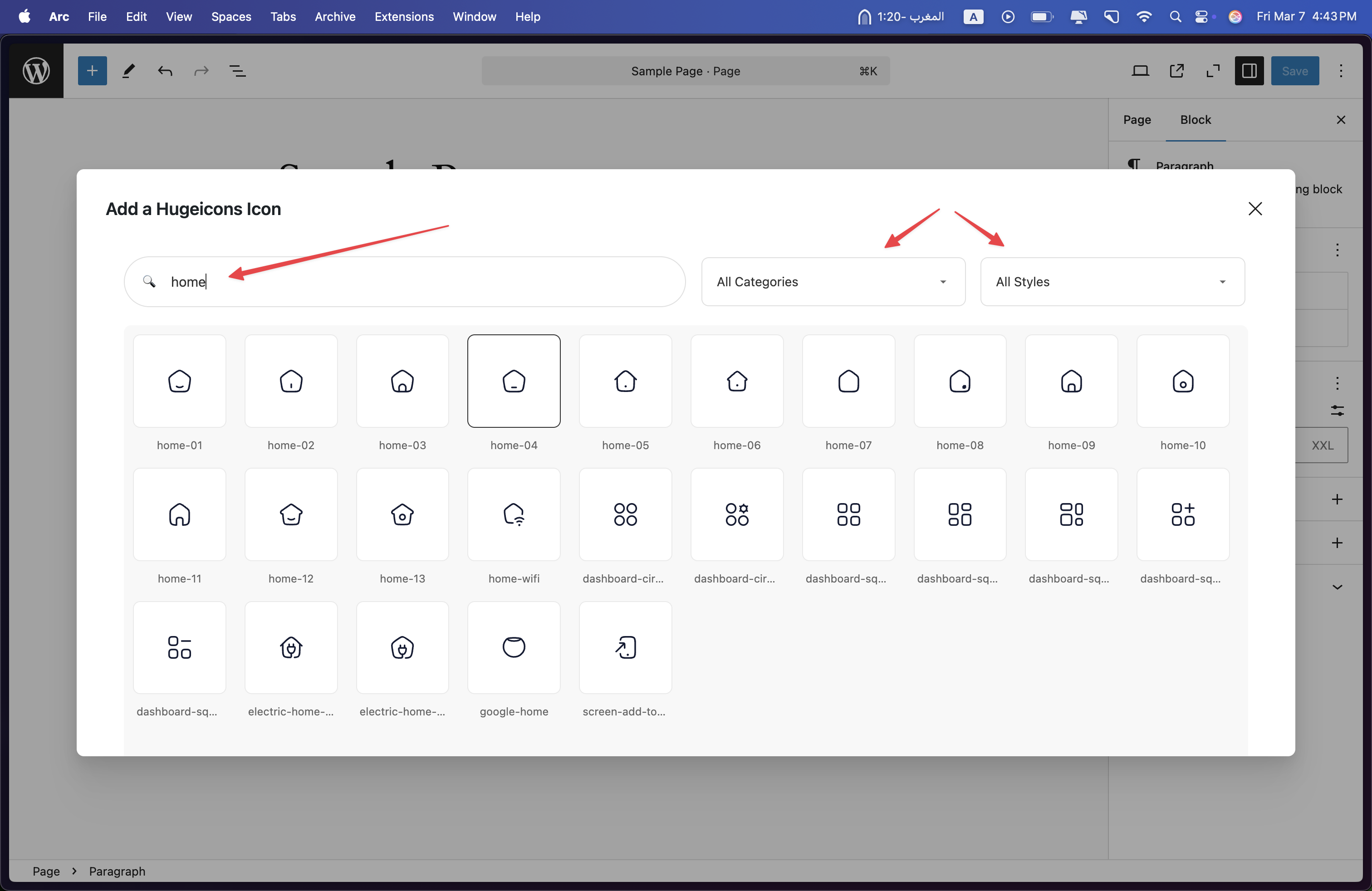
### Using the Icon Picker
1. Click the Hugeicons button in your editor
2. Search and select your desired icon
3. Insert it into your content
### Using Shortcodes
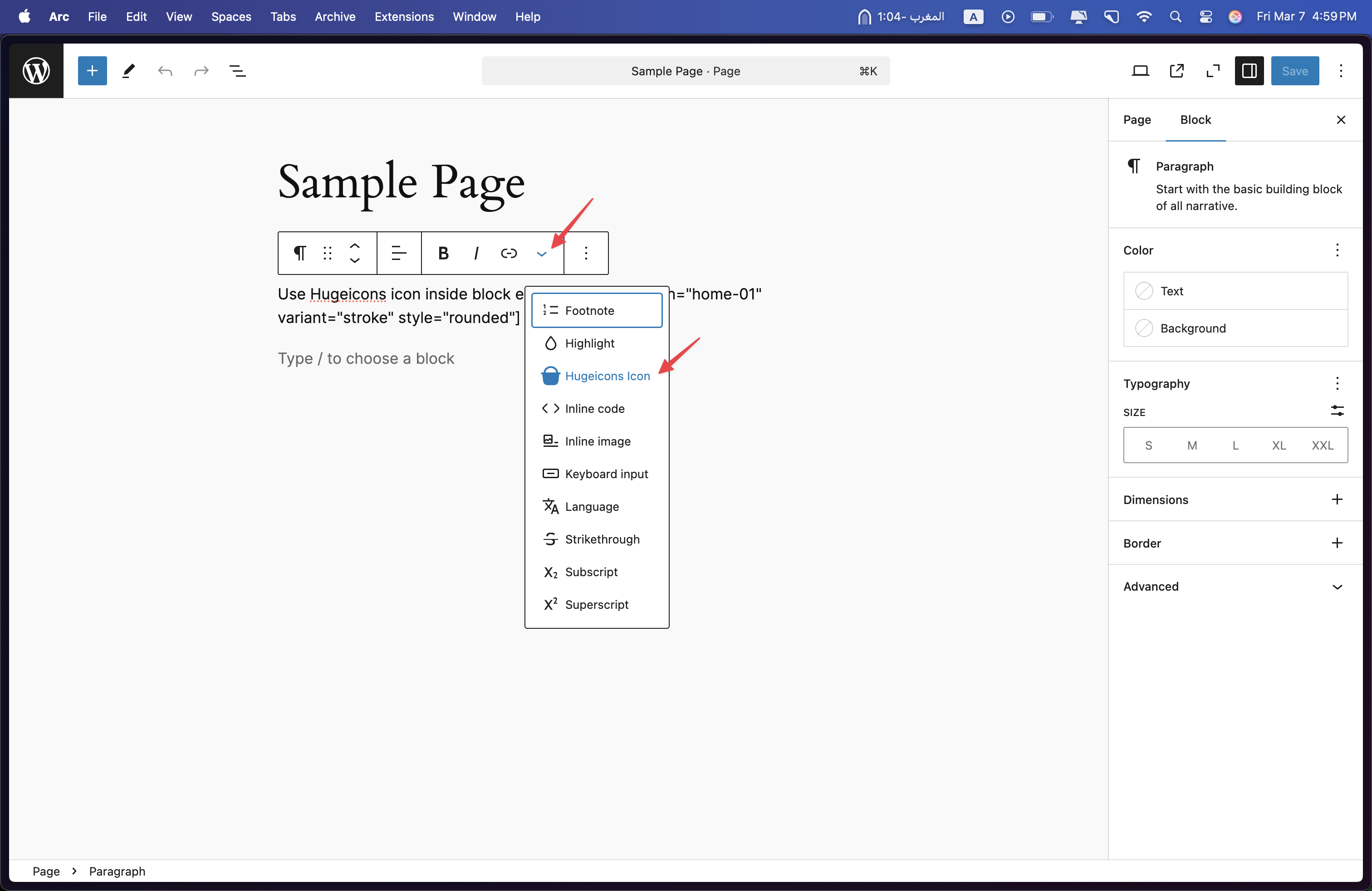
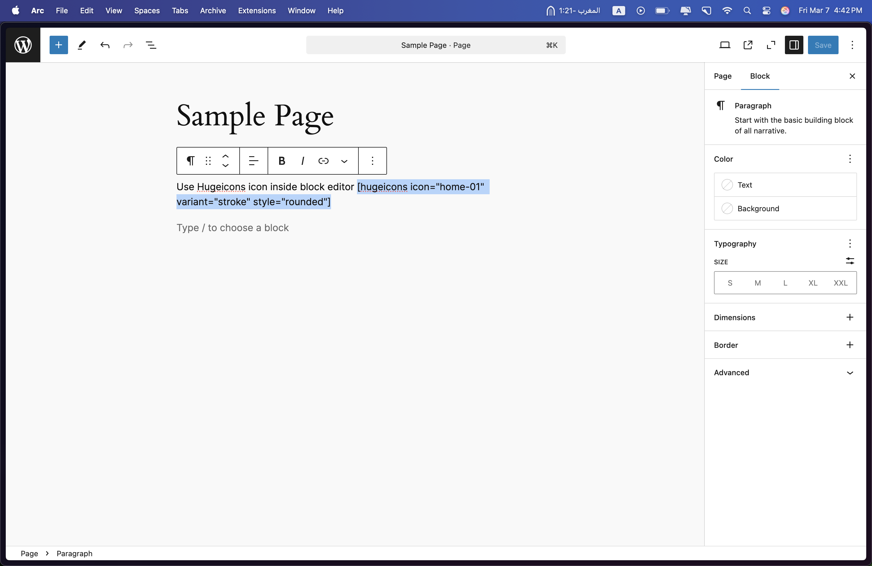
```php
[hugeicons icon="icon-name" size="32" color="#333333"]
```
## System Requirements
- WordPress 5.0 or higher
- PHP 7.4 or higher
## External Services
The plugin connects to Hugeicons' servers for the following purpose:
**Icons API Service**
- **Endpoint**: `https://hugeicons.com/api`
- **Purpose**: Fetches icon metadata and updates
- **When**: Only during icon picker usage in the WordPress editor
- **Data**: Only technical requests for icon data; no personal information is transmitted
## Screenshots
Here are the key interfaces and features of the Hugeicons WordPress plugin:
### Rich Text Controls
Add icons directly through the WordPress rich text editor interface.
### Icon Selection Modal
Search and filter through the extensive icon library using our intuitive icon picker modal.
### Implementation Example
See how icons are implemented in your WordPress content.
### Frontend View
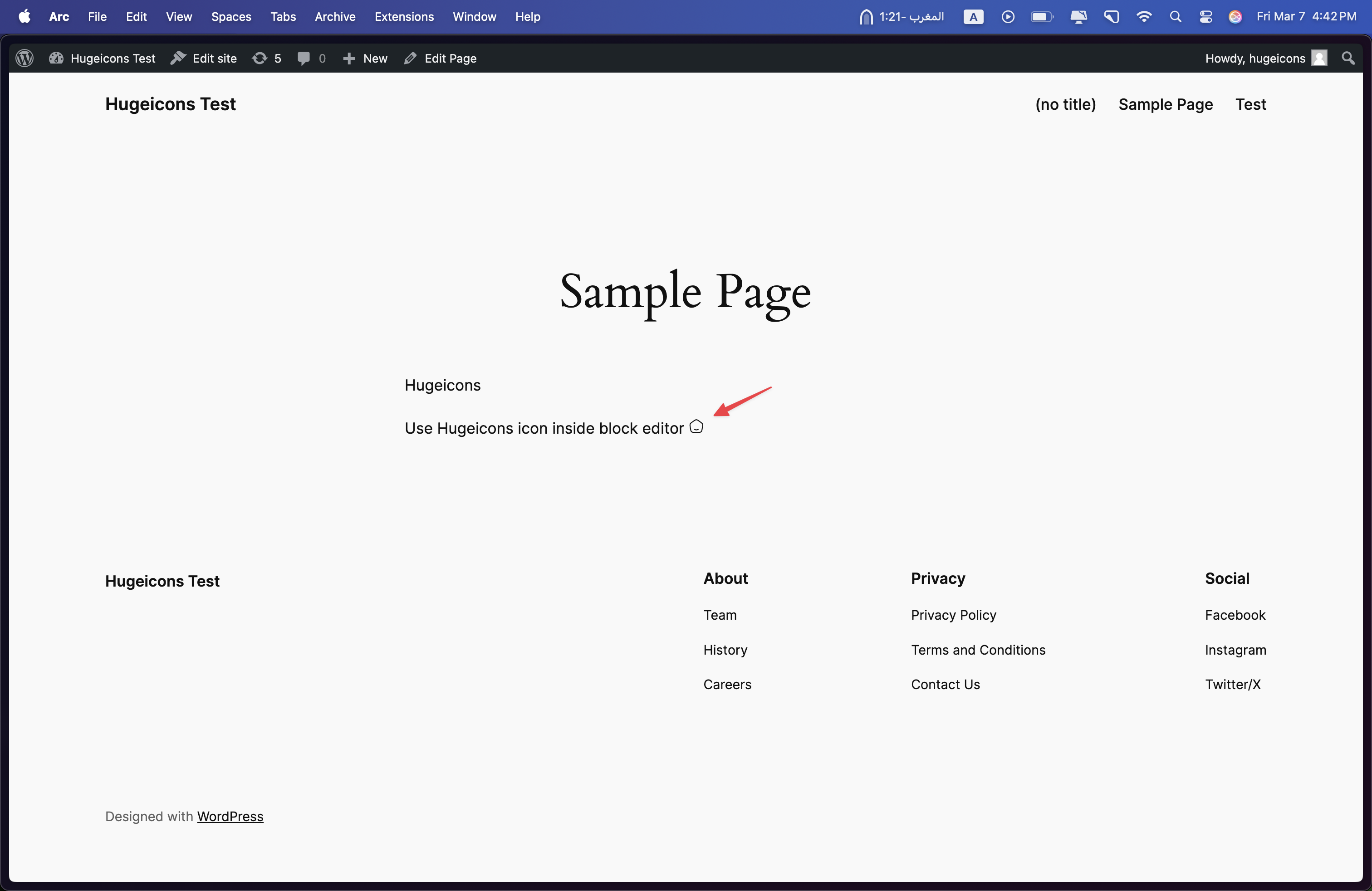
Preview of how icons appear on your live WordPress site.
# Quick Start with Hugeicons Free Icon Font
Get started quickly with Hugeicons Free Icon Font - a collection of 4,000+ high-quality stroke-rounded icons perfect for your web projects. This guide will help you set up and use our icon font in minutes.
## Installation
The fastest way to get started is by using our CDN. Simply add this line to the `` section of your HTML:
```html
```
This gives you instant access to our complete collection of 4,000+ free stroke-rounded icons, hosted on Google Cloud CDN for reliable performance.
## Usage
Using icons is straightforward:
1. Add the CDN link to your HTML head section
2. Insert icons using the `` tag with the appropriate class name
3. Browse our icon collection to find the perfect icons for your project
### Usage Example
Here's a complete example showing how to implement multiple icons:
```html
Hugeicons Example
abacus
absolute
acceleration
access
```
Each icon is implemented using the `hgi-stroke` class combined with the specific icon class (e.g., `hgi-abacus`, `hgi-absolute`, etc.).
## Features
- **4,000+ Free Icons**: Access our complete collection of stroke-rounded icons
- **Multiple Formats**: Available in TTF, WOFF, WOFF2, EOT, and SVG formats for maximum compatibility
- **No Attribution Required**: Free for both personal and commercial use
- **Google Cloud CDN**: Fast and reliable delivery worldwide
- **Cross-Browser Support**: Works seamlessly across all modern browsers
## Available Formats
Hugeicons Free Icon Font supports multiple formats to ensure compatibility across different platforms and browsers:
- WOFF2 (Primary format for modern browsers)
- WOFF (Broad browser support)
- TTF (TrueType Font)
- EOT (For legacy IE support)
- SVG (Vector format)
## Looking for More?
While our free version offers 4,000+ high-quality icons, you can unlock even more possibilities with Hugeicons Pro:
- Access to 40,000+ icons in 9 different styles
- Cloudflare CDN for enhanced performance
- Regular updates with new icons
- Exclusive features and early access to new releases
# Use a Set
Hugeicons Icon Sets are here to make your projects faster, simpler, and more efficient. With a reliable CDN, flexible styles, and thousands of icons at your fingertips, it's the all-in-one solution you've been looking for.
## What is an Icon Set?
Hugeicons Sets make it easy to keep your projects fast and efficient. Choose a single icon style that fits your design and load only the icons you need—no extra files or slow load times. With our private CDN, your icons will load instantly, keeping your website smooth and optimized
##### Fast and CDN Hosted:
Hugeicons Icon Font is hosted on a fast and reliable CDN, ensuring that your icons load instantly for better performance.
##### Lightweight:
Only load the styles you need to keep your projects fast and optimized.
##### Easy to Use:
Get started quickly with just a single line of code—no complex setup required.
##### Customizable:
Easily adjust the size, color, and effects of your icons to match your design perfectly.
## Available Icon Styles
Hugeicons offers multiple icon styles to match your design needs:
### Stroke Styles
- **Rounded**: Soft, modern edges for a friendly interface
- **Sharp**: Clean, crisp corners for precise designs
- **Standard**: Classic stroke style for versatile use
### Solid Styles
- **Rounded**: Filled icons with smooth corners
- **Sharp**: Solid icons with defined edges
- **Standard**: Traditional solid style icons
### Special Styles
- **Bulk**: Bold, heavy-weight icons
- **Duotone**: Two-tone design for depth
- **Twotone**: Alternative two-color styling
## How to Create a Set?
1. Log in to your Hugeicons account.
2. Navigate to the "Icon Sets" tab at the top.
3. Click "Create new" to start building your set.
4. Choose your preferred icon style and customize your set:
- Set a name for your icon collection
- Select your preferred style (Stroke, Solid, or Special)
5. Once created, you'll get a unique embed code for your set.
## Installation
Add the following code to the `` section of your HTML:
```html
```
## Usage
To use an icon from your set, use the following HTML structure:
```html
```
The class names follow this pattern:
- `hgi`: Base class for all Hugeicons
- `hgi-stroke`: Style variant (can be stroke, solid, or special styles)
- `hgi-user`: Specific icon name
### Finding Icon
You can easily find the icon name and get the exact usage code from our website's icon preview sheet. Each icon comes with:
- Icon preview
- Available style variations
- Framework-specific code snippets (Web, React, React Native, Vue, Svelte, Flutter, Angular)
- Size and color customization options
- Download options for SVG and PNG formats

The preview sheet provides everything you need to implement icons in your project, including:
- Icon name and class
- Framework-specific code snippets
- Size customization (e.g., 128px)
- Color selection (#000000)
- Download options for different formats# Icon Selection
Selecting the right icons for your application is crucial for creating an intuitive and aesthetically pleasing user interface. Icons serve as visual cues that help users navigate your application and understand its features quickly. This guide provides best practices for icon selection to enhance your application's design and usability.
## Understand Your Audience
Before choosing icons, it's essential to understand your target audience. Consider the cultural context, age group, and technical proficiency of your users. Icons that are intuitive for one group may not be for another. Tailoring your icon selection to your audience ensures that your application is user-friendly and accessible.
## Consistency is Key
Maintain consistency in style, size, and color across all icons within your application. Consistency helps to create a cohesive look and feel, making your application appear more professional and easier to use. Whether you choose outlined, filled, or colored icons, ensure that the same style is applied throughout.
## Clarity and Simplicity
Choose icons that are simple and easily recognizable. Complex icons can be confusing and may not convey their intended meaning at a glance. Icons should be straightforward, with a clear connection to their function or the content they represent.
## Size and Readability
Ensure that icons are appropriately sized for their context. Icons should be large enough to be easily identifiable without overwhelming the surrounding content. Consider the different devices and screen sizes your application will be used on and adjust icon sizes accordingly.
## Test for Comprehension
Test your icons with a segment of your target audience to ensure they are easily understood. What may seem obvious to you might not be to others. Gathering feedback early in the design process can save time and effort by identifying icons that may need to be replaced or modified.
## Use Text Labels When Necessary
While icons can significantly reduce text clutter and make your application more visually appealing, some functions may require additional clarification. In cases where an icon's purpose isn't immediately apparent, consider using a text label to eliminate ambiguity.
## Accessibility Considerations
Ensure your icons are accessible to all users, including those with visual impairments. Use alt text for icons to provide a text alternative. Additionally, consider color contrasts and the use of symbols that are universally recognized to accommodate users with color vision deficiencies.
## Keep Up with Trends
Icon styles can evolve over time. Stay informed about current design trends to keep your application looking modern. However, always prioritize clarity and functionality over aesthetic trends.
## Conclusion
Choosing the right icons is a delicate balance between design, functionality, and user experience. By following these best practices, you can select icons that enhance your application's usability and aesthetic appeal. Remember, the goal is to create an intuitive and engaging environment for your users, where icons play a pivotal role in navigation and interaction.
# Application Integration Best Practices
Integrating icons into your application is not just about choosing the right visuals; it's also about ensuring they enhance usability, maintain consistency, and align with your brand. This guide provides best practices for incorporating HugeIcons into your application effectively.
## Consistency is Key
Ensure consistent use of icons throughout your application. Consistency in icon style (e.g., outline, filled), size, and color enhances the user experience and reinforces your brand identity.
- **Style Consistency:** Stick to a single variant (e.g., stroke, solid) across all icons to maintain a cohesive look.
- **Size Consistency:** Use consistent icon sizes for similar elements across your application. For example, all icons in your navigation bar should be the same size.
- **Color Consistency:** Use your brand colors for icons when appropriate, but ensure they are legible against their background.
## Enhance Usability
Icons should make your application more intuitive and accessible to users. Follow these guidelines to enhance usability:
- **Descriptive Icons:** Choose icons that clearly communicate their function or meaning to avoid confusion.
- **Labels:** Accompany icons with text labels for critical actions, especially if the icon's meaning might not be immediately obvious to all users.
- **Accessible Design:** Ensure icons are accessible to users with disabilities.
## Keep Your Icon Library Updated
HugeIcons regularly updates its library with new icons and features. Stay up-to-date with these releases to take advantage of the latest designs and improvements.
- **Regular Updates:** Check for updates to the HugeIcons library and incorporate them into your application to keep your icon set fresh and relevant.
 Each icon is implemented using the `hgi-stroke` class combined with the specific icon class (e.g., `hgi-abacus`, `hgi-absolute`, etc.).
## Features
- **4,000+ Free Icons**: Access our complete collection of stroke-rounded icons
- **Multiple Formats**: Available in TTF, WOFF, WOFF2, EOT, and SVG formats for maximum compatibility
- **No Attribution Required**: Free for both personal and commercial use
- **Google Cloud CDN**: Fast and reliable delivery worldwide
- **Cross-Browser Support**: Works seamlessly across all modern browsers
## Available Formats
Hugeicons Free Icon Font supports multiple formats to ensure compatibility across different platforms and browsers:
- WOFF2 (Primary format for modern browsers)
- WOFF (Broad browser support)
- TTF (TrueType Font)
- EOT (For legacy IE support)
- SVG (Vector format)
## Looking for More?
While our free version offers 4,000+ high-quality icons, you can unlock even more possibilities with Hugeicons Pro:
- Access to 40,000+ icons in 9 different styles
- Cloudflare CDN for enhanced performance
- Regular updates with new icons
- Exclusive features and early access to new releases
# Use a Set
Hugeicons Icon Sets are here to make your projects faster, simpler, and more efficient. With a reliable CDN, flexible styles, and thousands of icons at your fingertips, it's the all-in-one solution you've been looking for.
## What is an Icon Set?
Hugeicons Sets make it easy to keep your projects fast and efficient. Choose a single icon style that fits your design and load only the icons you need—no extra files or slow load times. With our private CDN, your icons will load instantly, keeping your website smooth and optimized
##### Fast and CDN Hosted:
Hugeicons Icon Font is hosted on a fast and reliable CDN, ensuring that your icons load instantly for better performance.
##### Lightweight:
Only load the styles you need to keep your projects fast and optimized.
##### Easy to Use:
Get started quickly with just a single line of code—no complex setup required.
##### Customizable:
Easily adjust the size, color, and effects of your icons to match your design perfectly.
## Available Icon Styles
Hugeicons offers multiple icon styles to match your design needs:
### Stroke Styles
- **Rounded**: Soft, modern edges for a friendly interface
- **Sharp**: Clean, crisp corners for precise designs
- **Standard**: Classic stroke style for versatile use
### Solid Styles
- **Rounded**: Filled icons with smooth corners
- **Sharp**: Solid icons with defined edges
- **Standard**: Traditional solid style icons
### Special Styles
- **Bulk**: Bold, heavy-weight icons
- **Duotone**: Two-tone design for depth
- **Twotone**: Alternative two-color styling
## How to Create a Set?
1. Log in to your Hugeicons account.
2. Navigate to the "Icon Sets" tab at the top.
3. Click "Create new" to start building your set.
4. Choose your preferred icon style and customize your set:
- Set a name for your icon collection
- Select your preferred style (Stroke, Solid, or Special)
5. Once created, you'll get a unique embed code for your set.
## Installation
Add the following code to the `` section of your HTML:
```html
```
## Usage
To use an icon from your set, use the following HTML structure:
```html
```
The class names follow this pattern:
- `hgi`: Base class for all Hugeicons
- `hgi-stroke`: Style variant (can be stroke, solid, or special styles)
- `hgi-user`: Specific icon name
### Finding Icon
You can easily find the icon name and get the exact usage code from our website's icon preview sheet. Each icon comes with:
- Icon preview
- Available style variations
- Framework-specific code snippets (Web, React, React Native, Vue, Svelte, Flutter, Angular)
- Size and color customization options
- Download options for SVG and PNG formats

The preview sheet provides everything you need to implement icons in your project, including:
- Icon name and class
- Framework-specific code snippets
- Size customization (e.g., 128px)
- Color selection (#000000)
- Download options for different formats# Icon Selection
Selecting the right icons for your application is crucial for creating an intuitive and aesthetically pleasing user interface. Icons serve as visual cues that help users navigate your application and understand its features quickly. This guide provides best practices for icon selection to enhance your application's design and usability.
## Understand Your Audience
Before choosing icons, it's essential to understand your target audience. Consider the cultural context, age group, and technical proficiency of your users. Icons that are intuitive for one group may not be for another. Tailoring your icon selection to your audience ensures that your application is user-friendly and accessible.
## Consistency is Key
Maintain consistency in style, size, and color across all icons within your application. Consistency helps to create a cohesive look and feel, making your application appear more professional and easier to use. Whether you choose outlined, filled, or colored icons, ensure that the same style is applied throughout.
## Clarity and Simplicity
Choose icons that are simple and easily recognizable. Complex icons can be confusing and may not convey their intended meaning at a glance. Icons should be straightforward, with a clear connection to their function or the content they represent.
## Size and Readability
Ensure that icons are appropriately sized for their context. Icons should be large enough to be easily identifiable without overwhelming the surrounding content. Consider the different devices and screen sizes your application will be used on and adjust icon sizes accordingly.
## Test for Comprehension
Test your icons with a segment of your target audience to ensure they are easily understood. What may seem obvious to you might not be to others. Gathering feedback early in the design process can save time and effort by identifying icons that may need to be replaced or modified.
## Use Text Labels When Necessary
While icons can significantly reduce text clutter and make your application more visually appealing, some functions may require additional clarification. In cases where an icon's purpose isn't immediately apparent, consider using a text label to eliminate ambiguity.
## Accessibility Considerations
Ensure your icons are accessible to all users, including those with visual impairments. Use alt text for icons to provide a text alternative. Additionally, consider color contrasts and the use of symbols that are universally recognized to accommodate users with color vision deficiencies.
## Keep Up with Trends
Icon styles can evolve over time. Stay informed about current design trends to keep your application looking modern. However, always prioritize clarity and functionality over aesthetic trends.
## Conclusion
Choosing the right icons is a delicate balance between design, functionality, and user experience. By following these best practices, you can select icons that enhance your application's usability and aesthetic appeal. Remember, the goal is to create an intuitive and engaging environment for your users, where icons play a pivotal role in navigation and interaction.
# Application Integration Best Practices
Integrating icons into your application is not just about choosing the right visuals; it's also about ensuring they enhance usability, maintain consistency, and align with your brand. This guide provides best practices for incorporating HugeIcons into your application effectively.
## Consistency is Key
Ensure consistent use of icons throughout your application. Consistency in icon style (e.g., outline, filled), size, and color enhances the user experience and reinforces your brand identity.
- **Style Consistency:** Stick to a single variant (e.g., stroke, solid) across all icons to maintain a cohesive look.
- **Size Consistency:** Use consistent icon sizes for similar elements across your application. For example, all icons in your navigation bar should be the same size.
- **Color Consistency:** Use your brand colors for icons when appropriate, but ensure they are legible against their background.
## Enhance Usability
Icons should make your application more intuitive and accessible to users. Follow these guidelines to enhance usability:
- **Descriptive Icons:** Choose icons that clearly communicate their function or meaning to avoid confusion.
- **Labels:** Accompany icons with text labels for critical actions, especially if the icon's meaning might not be immediately obvious to all users.
- **Accessible Design:** Ensure icons are accessible to users with disabilities.
## Keep Your Icon Library Updated
HugeIcons regularly updates its library with new icons and features. Stay up-to-date with these releases to take advantage of the latest designs and improvements.
- **Regular Updates:** Check for updates to the HugeIcons library and incorporate them into your application to keep your icon set fresh and relevant.
Each icon is implemented using the `hgi-stroke` class combined with the specific icon class (e.g., `hgi-abacus`, `hgi-absolute`, etc.).
## Features
- **4,000+ Free Icons**: Access our complete collection of stroke-rounded icons
- **Multiple Formats**: Available in TTF, WOFF, WOFF2, EOT, and SVG formats for maximum compatibility
- **No Attribution Required**: Free for both personal and commercial use
- **Google Cloud CDN**: Fast and reliable delivery worldwide
- **Cross-Browser Support**: Works seamlessly across all modern browsers
## Available Formats
Hugeicons Free Icon Font supports multiple formats to ensure compatibility across different platforms and browsers:
- WOFF2 (Primary format for modern browsers)
- WOFF (Broad browser support)
- TTF (TrueType Font)
- EOT (For legacy IE support)
- SVG (Vector format)
## Looking for More?
While our free version offers 4,000+ high-quality icons, you can unlock even more possibilities with Hugeicons Pro:
- Access to 40,000+ icons in 9 different styles
- Cloudflare CDN for enhanced performance
- Regular updates with new icons
- Exclusive features and early access to new releases
# Use a Set
Hugeicons Icon Sets are here to make your projects faster, simpler, and more efficient. With a reliable CDN, flexible styles, and thousands of icons at your fingertips, it's the all-in-one solution you've been looking for.
## What is an Icon Set?
Hugeicons Sets make it easy to keep your projects fast and efficient. Choose a single icon style that fits your design and load only the icons you need—no extra files or slow load times. With our private CDN, your icons will load instantly, keeping your website smooth and optimized
##### Fast and CDN Hosted:
Hugeicons Icon Font is hosted on a fast and reliable CDN, ensuring that your icons load instantly for better performance.
##### Lightweight:
Only load the styles you need to keep your projects fast and optimized.
##### Easy to Use:
Get started quickly with just a single line of code—no complex setup required.
##### Customizable:
Easily adjust the size, color, and effects of your icons to match your design perfectly.
## Available Icon Styles
Hugeicons offers multiple icon styles to match your design needs:
### Stroke Styles
- **Rounded**: Soft, modern edges for a friendly interface
- **Sharp**: Clean, crisp corners for precise designs
- **Standard**: Classic stroke style for versatile use
### Solid Styles
- **Rounded**: Filled icons with smooth corners
- **Sharp**: Solid icons with defined edges
- **Standard**: Traditional solid style icons
### Special Styles
- **Bulk**: Bold, heavy-weight icons
- **Duotone**: Two-tone design for depth
- **Twotone**: Alternative two-color styling
## How to Create a Set?
1. Log in to your Hugeicons account.
2. Navigate to the "Icon Sets" tab at the top.
3. Click "Create new" to start building your set.
4. Choose your preferred icon style and customize your set:
- Set a name for your icon collection
- Select your preferred style (Stroke, Solid, or Special)
5. Once created, you'll get a unique embed code for your set.
## Installation
Add the following code to the `` section of your HTML:
```html
```
## Usage
To use an icon from your set, use the following HTML structure:
```html
```
The class names follow this pattern:
- `hgi`: Base class for all Hugeicons
- `hgi-stroke`: Style variant (can be stroke, solid, or special styles)
- `hgi-user`: Specific icon name
### Finding Icon
You can easily find the icon name and get the exact usage code from our website's icon preview sheet. Each icon comes with:
- Icon preview
- Available style variations
- Framework-specific code snippets (Web, React, React Native, Vue, Svelte, Flutter, Angular)
- Size and color customization options
- Download options for SVG and PNG formats

The preview sheet provides everything you need to implement icons in your project, including:
- Icon name and class
- Framework-specific code snippets
- Size customization (e.g., 128px)
- Color selection (#000000)
- Download options for different formats# Icon Selection
Selecting the right icons for your application is crucial for creating an intuitive and aesthetically pleasing user interface. Icons serve as visual cues that help users navigate your application and understand its features quickly. This guide provides best practices for icon selection to enhance your application's design and usability.
## Understand Your Audience
Before choosing icons, it's essential to understand your target audience. Consider the cultural context, age group, and technical proficiency of your users. Icons that are intuitive for one group may not be for another. Tailoring your icon selection to your audience ensures that your application is user-friendly and accessible.
## Consistency is Key
Maintain consistency in style, size, and color across all icons within your application. Consistency helps to create a cohesive look and feel, making your application appear more professional and easier to use. Whether you choose outlined, filled, or colored icons, ensure that the same style is applied throughout.
## Clarity and Simplicity
Choose icons that are simple and easily recognizable. Complex icons can be confusing and may not convey their intended meaning at a glance. Icons should be straightforward, with a clear connection to their function or the content they represent.
## Size and Readability
Ensure that icons are appropriately sized for their context. Icons should be large enough to be easily identifiable without overwhelming the surrounding content. Consider the different devices and screen sizes your application will be used on and adjust icon sizes accordingly.
## Test for Comprehension
Test your icons with a segment of your target audience to ensure they are easily understood. What may seem obvious to you might not be to others. Gathering feedback early in the design process can save time and effort by identifying icons that may need to be replaced or modified.
## Use Text Labels When Necessary
While icons can significantly reduce text clutter and make your application more visually appealing, some functions may require additional clarification. In cases where an icon's purpose isn't immediately apparent, consider using a text label to eliminate ambiguity.
## Accessibility Considerations
Ensure your icons are accessible to all users, including those with visual impairments. Use alt text for icons to provide a text alternative. Additionally, consider color contrasts and the use of symbols that are universally recognized to accommodate users with color vision deficiencies.
## Keep Up with Trends
Icon styles can evolve over time. Stay informed about current design trends to keep your application looking modern. However, always prioritize clarity and functionality over aesthetic trends.
## Conclusion
Choosing the right icons is a delicate balance between design, functionality, and user experience. By following these best practices, you can select icons that enhance your application's usability and aesthetic appeal. Remember, the goal is to create an intuitive and engaging environment for your users, where icons play a pivotal role in navigation and interaction.
# Application Integration Best Practices
Integrating icons into your application is not just about choosing the right visuals; it's also about ensuring they enhance usability, maintain consistency, and align with your brand. This guide provides best practices for incorporating HugeIcons into your application effectively.
## Consistency is Key
Ensure consistent use of icons throughout your application. Consistency in icon style (e.g., outline, filled), size, and color enhances the user experience and reinforces your brand identity.
- **Style Consistency:** Stick to a single variant (e.g., stroke, solid) across all icons to maintain a cohesive look.
- **Size Consistency:** Use consistent icon sizes for similar elements across your application. For example, all icons in your navigation bar should be the same size.
- **Color Consistency:** Use your brand colors for icons when appropriate, but ensure they are legible against their background.
## Enhance Usability
Icons should make your application more intuitive and accessible to users. Follow these guidelines to enhance usability:
- **Descriptive Icons:** Choose icons that clearly communicate their function or meaning to avoid confusion.
- **Labels:** Accompany icons with text labels for critical actions, especially if the icon's meaning might not be immediately obvious to all users.
- **Accessible Design:** Ensure icons are accessible to users with disabilities.
## Keep Your Icon Library Updated
HugeIcons regularly updates its library with new icons and features. Stay up-to-date with these releases to take advantage of the latest designs and improvements.
- **Regular Updates:** Check for updates to the HugeIcons library and incorporate them into your application to keep your icon set fresh and relevant.